Category Archives: Graphic design

Hola Qatiq: пост признания в любви

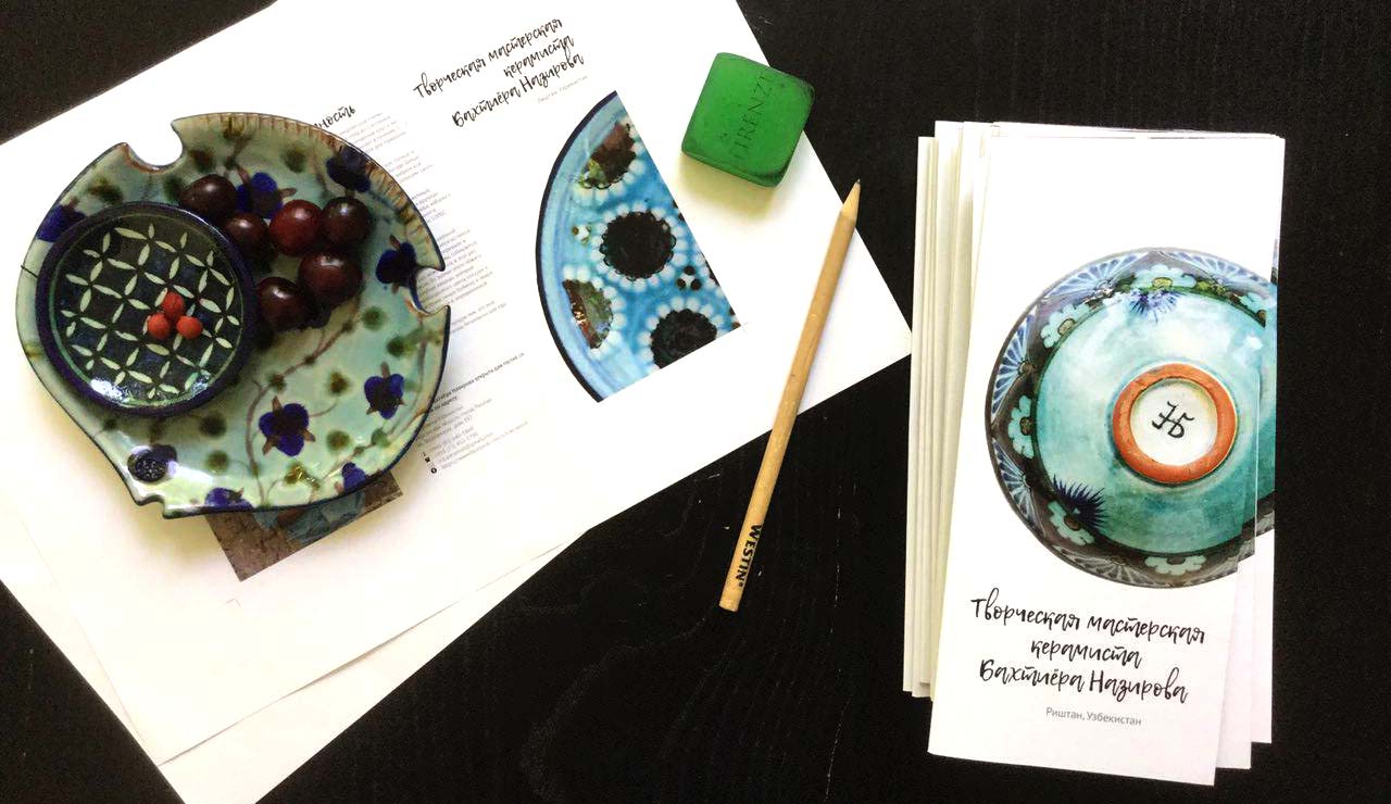
У меня есть очень чёткая жизненная позиция – мусора от моего существования должно быть минимум. Макулатуру и пластик я собираю в отдельные пакеты и сдаю мусорщику, он уже сам знает что делать с этим добром. Органический мусор, который у меня ограничивается отходами от чистки овощей и фруктов я собираю в пакет,  замораживаю и раз в неделю передаю на корм баранам. В супермаркетах я не делаю покупки частично из-за этой же моей философии – в супермаркетах продукты продают в упаковках, а упаковка – это мусор, который нужно перерабатывать. На базар я хожу со своей тарой – контейнер для творога, баночка для сливок, свои сумки. Однако иногда, когда нет времени для полноценного базара и дома есть нечего я забегаю в супермаркет и покупаю что-нибудь. Обычно это творог или катик.

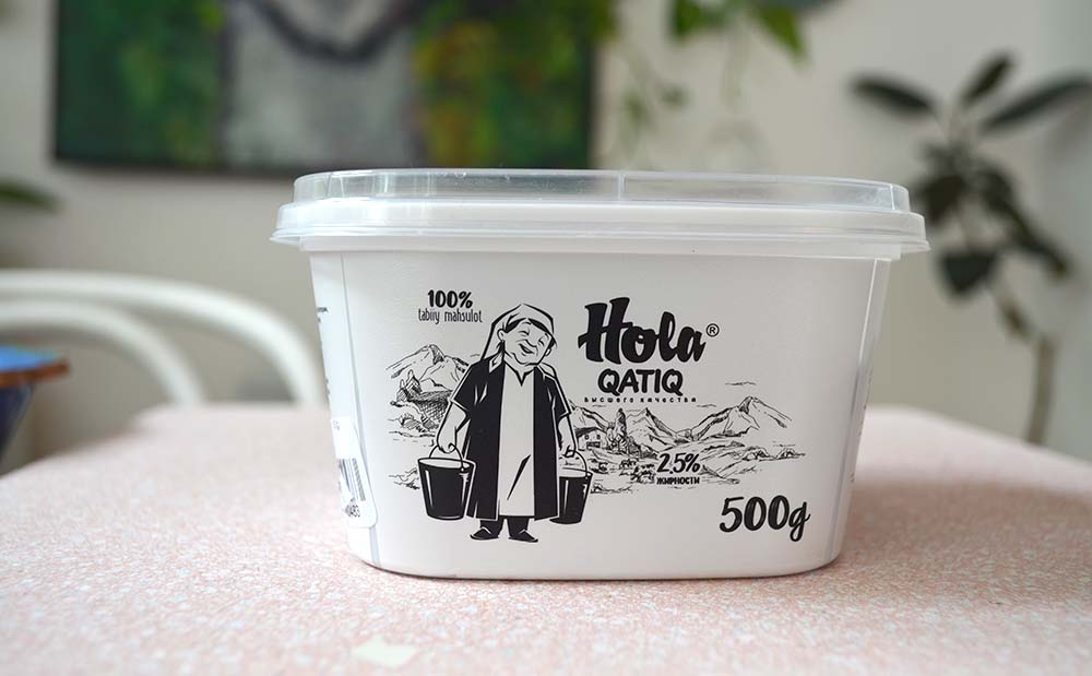
Так вот, пару месяцев назад, в отделе молочных продуктов я вижу упаковку, которая сначала привлекла моё внимание своей черно-белой простотой, потом покорила своим дизайном. Речь идёт о “Hola qatiq”. Вы видели эту тётушку со словами «Bolam, qatiq kerak mi?» По эмоциональному содержанию для меня, человека, который вырос в махалле, это равносильно тому, как меня родители ребёнком отправляли к соседям за катик и я, держа в руках пустую литровую банку, только переступив их ворота, орала на весь двор «опогим, катигиз борми?».

Одним словом, brand identity “Hola” – это любовь! Дизайнеры этого проекта, если вы читаете этот пост, давайте познакомимся. Иногда бывает нужна помощь графического дизайнера и мне кажется мы сработаемся.

P.S. кстати, катик тоже вкусный

Графика + керамика

Я графический дизайн 2 семестра зря не изучала. Серьезно, Photoshop и Indesign – мои верные друзья и  коллеги.  На самом деле я люблю графику. Поэтому, когда в Риштане  Бахтиёр ака и Диёрбек Назировы говорили что им нужна брошюра про их мастерскую и не знали с чего начать, я, как  меня учили в советских школах проявила инициативу.

Результат – первые 50 брошюр, которые в конце месяца поедут на выставку керамики в Россию.

“12 kinds of kindness”: fears, insecurities and graphic design

Long time, no posts… My life has been good and happy but a bit too hectic. I have a lot of catching up to do with the portfolio updates, photography and a few other things but first things first…

Happy New 2016!   (well ahead of time for Chinese New Year)

I wish us all peace, tolerance, acceptance, love and compassion.  As for myself my personal wish for this year is to slow down in a sort of slow-down-and-smell-the-roses way – quite a challenge for a hyperactive type like myself.

This specific post is to share a discovery and an inspiration which came through Jessica Walsh’ instagram post hash tagged #12kindsofkindness (www.12kindsofkindness.com).

The project is by two New York based graphic designers – Jessica Walsh and Timothy Goodman – exploring their behavior patterns, personal insecurities, baring their souls and bringing out their inner shit in a very honest and graphically beautiful way.

Speaking of honesty, this reminds me of a saying by another graphic designer, Stefan Sagmeister, who states  “everybody who is honest is interesting”. That’s exactly what I am seeing here – a self-therapy by  two very successful people talking about things that would normally find their way to a secret diary or, if life got real tough, would get discussed in a therapist’s office.

I was sort of familiar with Jessica Walsh – she collaborated with Bjarke Ingels Group on “Hot to Cold” book. It is Timothy Goodman whom I discovered recently and whose work I find to be  fresh and very authentic. Step 4 “Don’t beat yourself up” or instragram hasgtag  #memoriesofagirlineverknew is his own poetic exploration of his fears of commitments and real relationships – a great insight into a male psyche.

Here are a few highlights:


12 kinds of kindness | Memories of Girl I Never Knew
Timothy Goodman’s Memories of Girl I Never Knew #memoriesofagirlineverknew


http://12kindsofkindness.com/
“Firsts…” #memoriesofagirlineverknew by Timothy Goodman


“Likes..” #memoriesofagirlineverknew by Tomothy Goodman


Social Scandinavia rules again. This time in hand lettering.

Sometimes it feels like there is a lot of noise out there. I was about to  permanently close my Facebook account thinking I couldn’t take it anymore when a friend  showed me a way of “muting”  some hyper activity and cleaning up my home feed. Instragram, on the other hand, has been a great source of inspiration, especially in the area of graphic design. One of my favorites to this date has been Jonathan Faust, a graphic designer from Copenhagen, Denmark. He runs a daily challenge of doing hand lettering and uploading his work in Instragram for us to enjoy his clean, cool, balanced, elegant Scandinavian left-handed magic. His work is so inspirational that I am seriously considering playing with hand lettering myself too.

Follow him in instagram (#jonathanfaust) and check out his portfolio at www.jonathanfaust.com.

http://instagram.com/p/2Sj-WOt1H3/


Stefan Sagmeister: “stay small!”

I am a big fan of a Danish architectural firm BIG headed by Bjarke Ingels. Needless to say, I follow their work and read their interviews. Recently, while reading up on their new book ” HOT TO COLD, an odyssey of architectural adaptation” I made another discovery – Stefan Sagmeister! The man is a graphic designer and a partner at  “Sagmeister & Walsh” which worked on a design of “Hot to Cold” book.

Hot to Cold, BIG, Bjarke Ingels
“Hot to Cold” by Bjarke Ingels

I start googling Sagmeister’s work and reading his interviews.  Just like every encounter in life is to teach us something, one specific interview I read was like a guidance from above and an answer to my questions.

Continue reading Stefan Sagmeister: “stay small!”